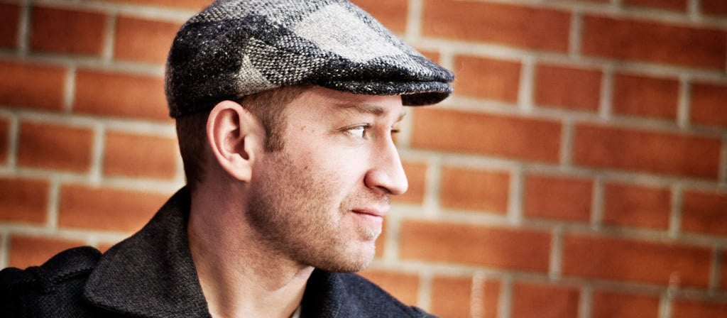
Smaller, Faster, More Responsive: An Interview With Mat Marquis
Mat Marquis is a maker of websites at Bocoup in Boston, but you probably know him better as the chair of the Responsive Issues Community Group, which recently delivered on its promise of a markup-based method of specifying responsive images in a cross-browser fashion. We sat down to chat with Mat about fighting to make sure developers' voices are heard in the web standards creation process, tuning website performance to build a web for everyone, hitchhiking to Mexico, jQuery Mobile, responsive images, and Mat's brand-new presentation for An Event Apart Atlanta.
How and where did you get your start in design, web or otherwise?
Man, that's a weird one.
I did some carpentry ages ago, but eventually the family business kinda fell out from under me. I bounced around from job to job: line cook, doorman at a college bar, a bunch of retail. I ended up working in a mall just off a highway, at one of those cellphone booths where people yell at you as you walk by, all “SIR. SIR. WHAT PHONE DO YOU HAVE? WE GOT FREE RAZR PHONES.” I was that guy. I didn't have a degree, I was living in a two-bedroom questionably legal apartment with four other guys and still barely making rent, and my career path had me slogging toward “department store greeter” as a retirement plan. It wasn't a great scene.
So, without a plan, I quit. I bought a backpack, made up my mind that it didn't much matter where I ended up, and started walking south. I was on the road for about three months, hitchhiking down the east coast, staying with friends and strangers here and there. While I was in Cape Coral, Florida, a friend of a friend asked if I could build her a website. I'd tooled around in Photoshop since 3.0, could type a whopping 25 words per minute, and needed money to get back out on the road, so I figured, sure, I could probably make a website. And I did. I made a magenta and fake-gloss nightmare of tables and font tags, born of the realization that whatever preinstalled GUI website-making program my buddy had on his ancient Compaq contained a button that let me draw stretchy squares. It's not still online anywhere, before anyone asks.
Long story shortened: I end up in Cozumel, Mexico. The hoodlums from home, meanwhile, had been saving what little money they had to buy me a plane ticket back. I get home and things haven't changed much: I'm a couple pounds lighter, but I still have no degree, no plan, and I'm not going back to retail.
I did manage to make a website that one time, though. Hmm.
A few years later, here I am.
So what was your next web gig after that? Or your first “professional” web gig, if you prefer?
Once I got back and relatively settled, I started fake-taking gigs on CraigsList—the kind that promise “exposure” and maybe lunch money. I'd never actually emailed anyone, though. I'd just read the description of the project, build it, and throw the results away. It was all just for practice.
Eventually I started taking gigs for pay. I don't remember which was the first exactly, but one of the first was a job installing phpBB. After I struggled my way through it, the client—Brunello Creative—asked me if I was looking for an internship for college credit.
I said “yes.”
I started that internship on February 14, 2008. We had a brief and slightly awkward conversation when my three-month “college credit” internship ran up, but they ended up hiring me anyway. It was my first job with a desk.
You were a contributor to jQuery Mobile. What was working on that like?
Building something that avoids those crazy mobile browser bugs is tricky, but building a framework that wouldn't let people run afoul of those bugs was playing web development on hard mode—there were times where I pined for the days of IE6 bugs. A few years ago, mobile development was a total wasteland: all JavaScript alerts for debugging, and throwing seemingly unrelated CSS at a problem just to see what sticks.
All told, I do miss working on it. I learned more from jQM than from any other project, hands-down, and it led me to some of my all-time favorite bugs, like this one:
When a
position: fixedelement appears anywhere on a page [on Android 2.x], most 2D CSS transforms will fail. …this issue is solved by setting a CSS opacity of .9 or below on the parent of the fixed element. (https://github.com/scottjehl/Device-Bugs/issues/3)
I mean, that issue is gold.
Responsive images are finally a standards thing—congratulations! What was the strongest (or hardest) lesson you learned in the process of getting to this point?
Man, I don't think I realized just how much time it was gonna eat up. That's not just me, either. There've been dozens of us working on this over the past few years.
I think the hardest lesson I learned was that we didn't really have much of a place in web standards, the everyday designers and developers. I was surprised by how often “developers will or won't like this” would come up as a talking point on various mailing lists, from one full-time browser representative to another. I think that's because, for the most part, we weren't there. Participating in web standards eats up a lot of time that you don't have when there's client work to be done. And these are conversations taking place in IRC channels and mailing lists that look like they cribbed design details from Windows 3.1, and neither one of them are the friendliest scenes to wander into. I know for my part, I always assumed it was something “handled”—that the important folks were there, everyone was represented, and I wasn't necessary and had nothing of merit to contribute.
We're there now—at least, a handful of us are—and that hasn't been the easiest transition for anyone involved. Web standards is frustrating and time-consuming work, but we need to be there. We need to bring to the table the real problems we face doing real work for real clients, under circumstances we can't always control. We need to be there to say whether we would or wouldn't use some proposal. That's messy, granted; we can't flood every mailing list with thousands of new voices all at once covering every possibly subject, and none of us have that kind of time. What we can do is look for—or build for ourselves—things like specifiction.org and community groups, to make sure those voices are represented.
You have a talk at An Event Apart Atlanta called "Smaller, Faster Websites". What will attendees take away from it?
The average website is approaching two megabytes.
Not for nothin', but we've got it pretty easy, browsing-wise. Fast computers and tons of bandwidth are all part of the job. A 2MB website with a couple of blocking requests for CSS and JavaScript and a few images will take long enough to show up that I'm apt to lose interest and go back to reading Twitter, but that's me browsing in a privileged context. A nuisance on my shiny new 4G iThing means an unusable website for someone on an older mobile device and an EDGE connection. It means we're building a web that's just for ourselves, not for everyone.
I touched on a lot of this in my responsive images talk last year, but this year we're taking everything a step further; we're going to talk about slimming down all our assets, and ensuring we're delivering them in the most efficient ways possible. We're going to look at ways of tailoring our development habits so that we're all building fast, lightweight websites by default—websites that work for everyone.
Thanks, Mat!
Mat Marquis will present “Smaller, Faster Websites” at An Event Apart Atlanta 2015, February 17–19, along with eleven other brilliant speakers. Don't miss your chance to learn from the best—register today!