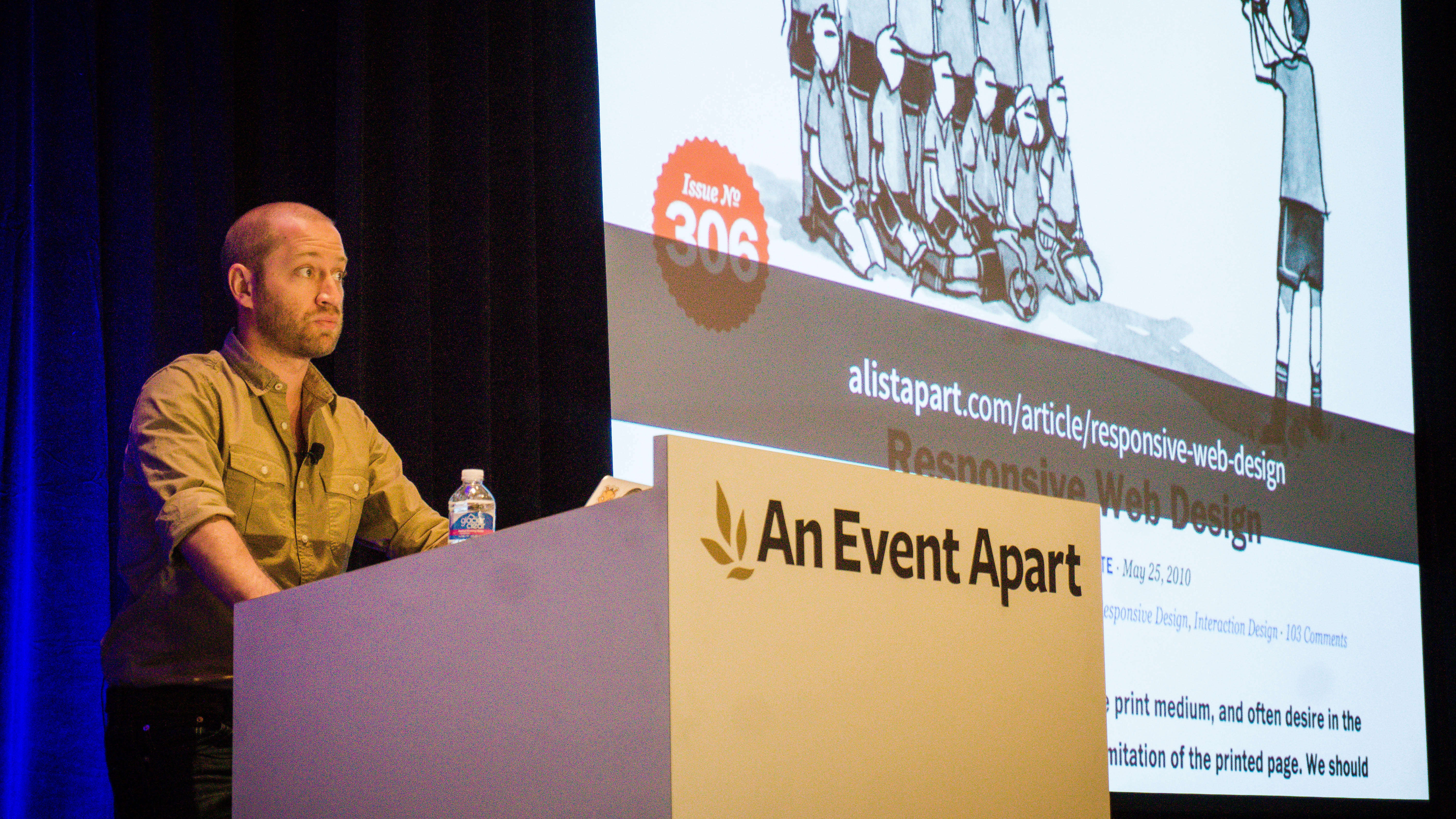
Multi-device Challenge: Smaller, Faster Websites with Mat Marquis at An Event Apart Boston
When your goal is to serve an ever-expanding landscape of browsers, devices, and connection speeds, a responsive layout is just the beginning. Users expect a site to load as fast—or faster—on their phones and tablets than anywhere else. It's a tightrope: you want to ensure that your content will reach your most demanding (and least powerfully equipped) users, but you don't want to sacrifice the experience for users with fast pipes and big screens.

There are tools and techniques that can help with this balancing act: bandwidth budgets, responsive images, smarter caching, leaner scripting, and more. Together, they can help you optimize the experience for all your users—without limiting the creativity of your team, and without massively inflating your deadlines. In his talk “Smaller, Faster Websites” at An Event Apart Boston 2015, Mat Marquis will discuss strategies for smarter asset delivery, techniques for avoiding potential points of failure, and development habits that help deal with a vast landscape of unknowns from the very start of a project.
Hailing from Cambridge, Massachusetts, Mat Marquis (@wilto) is an Open Web Engineer at Bocoup. He's also Chair of the Responsive Issues Community Group, technical editor at A List Apart, and a former member of the jQuery Mobile team. He's also very proud that he's finished Mega Man 2—on difficult—without losing a single life.
Mat is but one of twelve extraordinary presenters appearing at An Event Apart Boston 2015. See them all! Following the two-day conference of twelve great sessions comes A Day Apart: Everything You Wanted to Know About Responsive Design…And Less!, led by Brad Frost (Atomic Design). You can register just for the two-day conference, just for A Day Apart, or save $100 when you sign up for all three days. Check the schedule for details, and save an additional $100 if you register now through March 16.