Doing More With Less: Laziness in the Time of Responsive Design with Ethan Marcotte
As screens and input types evolve, we're managing more complexity in our designs than ever before. Our layouts are becoming more flexible and responsive, our interfaces more immersive. Maybe we can look for simpler approaches? In his talk “Laziness in the Time of Responsive Design” at An Event Apart Boston, responsive web design expert Ethan Marcotte—who describes himself as “a singularly lazy person”—will walk through some responsive designs, and use them to show how we might achieve a lot more with a little bit less.
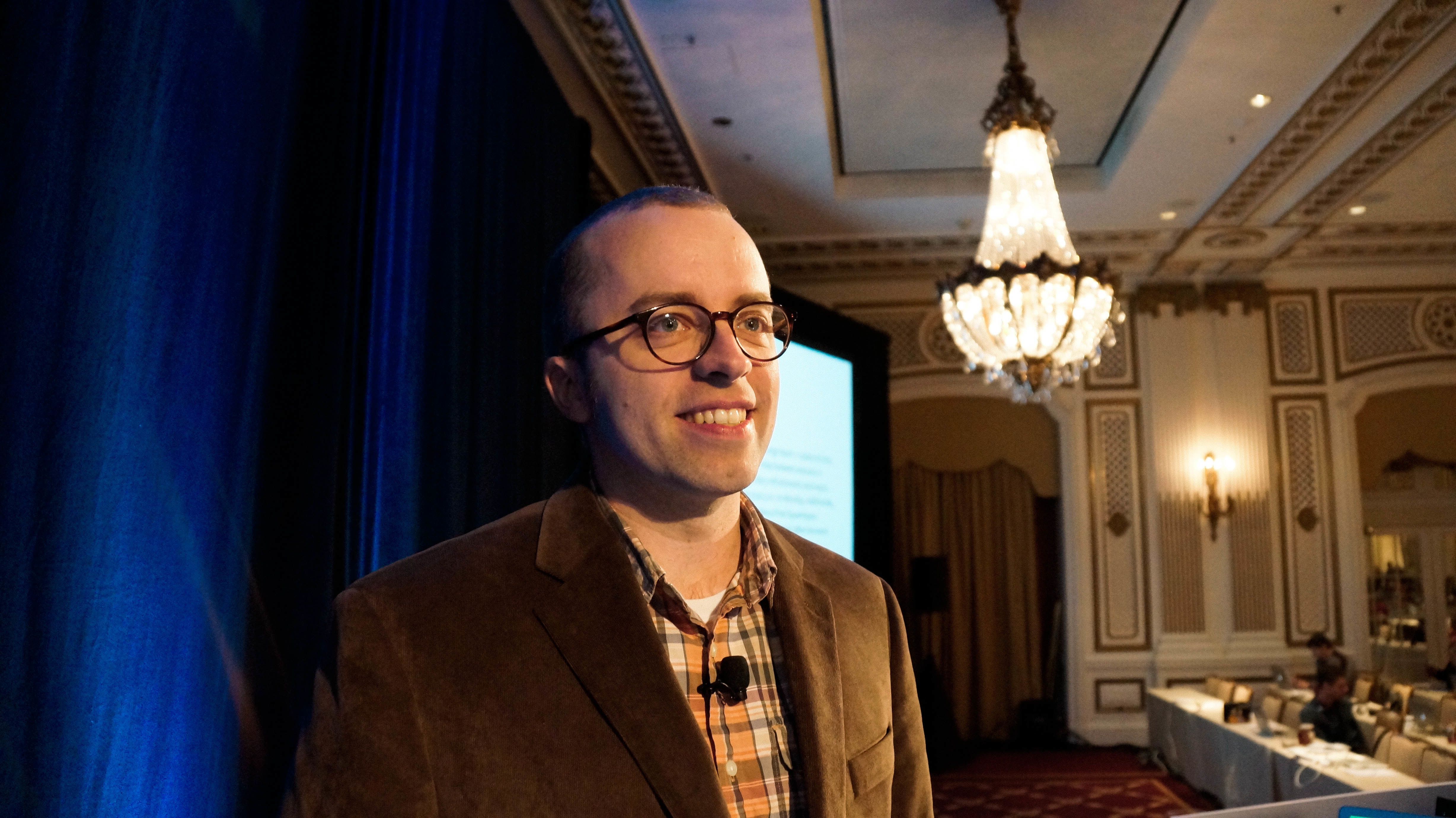
Ethan Marcotte is a designer/developer living in Cambridge, Massachusetts, who is passionate about beautiful design, elegant code, and the intersection of the two. He cofounded Editorially, and over the years his design clientele has included People Magazine, New York Magazine, the Sundance Film Festival, and The Boston Globe. He coined the term “responsive web design” to describe a new way of designing for the ever-changing web, and wrote the foundational book on the topic.
Lazy or not, Ethan is just one of twelve extraordinary presenters appearing at An Event Apart Boston 2015. See them all! Following the two-day conference of twelve great sessions comes A Day Apart: Everything You Wanted to Know About Responsive Design…And Less!, led by Brad Frost (Atomic Design). You can register just for the two-day conference, just for A Day Apart, or save $100 when you sign up for all three days. Check the schedule for details, and save an additional $100 if you register now through March 16.